

We refreshed the client area’s interface. Not a redesign for its own sake. We went after the spots where the portal made you work harder than the task deserved.
Better on every screen, especially small ones
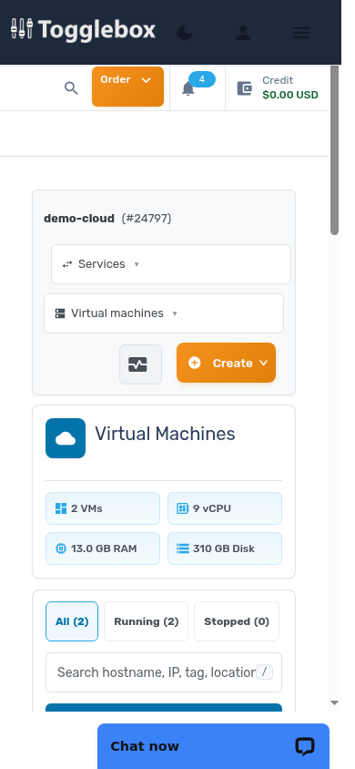
The layout is cleaner and more responsive. Mobile views now lead with what you actually check from a phone: what is running, what state it is in, and the controls you need right then. Managing a VM from wherever you happen to be no longer means pinch-zooming through a desktop layout.
Navigation that stays out of the way
Moving between instances, volumes, networking, and cloud tools is faster. A sidebar keeps your whole service one click away.
URLs are human-readable now. That sounds minor until you bookmark the exact page for a VM. Or send a teammate a link that says what it points at. Or read your own browser history and understand it.
None of this changes what the portal can do. It changes how much of your attention the portal costs, and day after day, that is the number that matters.
